
UI Blueprints in Code - How We Cut Design Implementation Time by 80%
{frontmatter.title}
Sometimes I look at our app and get a raging urge to throw it in the trash and start over.
And by sometimes, I mean daily. 😂
But the thing is, that ain't the way. Complete rewrites rarely work, and pixel-perfect redesigns take forever. What we need is a process that lets us move forward, bit by bit, making tangible improvements without getting bogged down.
I've been experimenting with a design workflow that's been incredibly productive for us at reconfigured, maybe it's something you can find value from.
If you're simply curious, this is how we build product at the small startup that is reconfigured. :-)
For context, I am a person with some background in graphical design, a slightly trained design eye, and basic software engineering skills.
Vibe-coding is incredibly powerful, but for this approach to work you got to get into the details.
The Problem: UI Spring Cleaning
A few weeks ago, we realized we had a serious user experience issue on our hands.
People were dropping off, some didn't even really get started.
We claim to make it incredibly easy (and even fun) to take notes on the go. And while we've succeeded in making it easy to capture notes, the UI experience has been... well, not optimal.
Our users were telling us the same thing. The app felt cluttered, with too many elements competing for attention, incredibly unclear what you were even supposed to do in the Journal interface.
It was time for some spring cleaning.
But how do you redesign an entire app section in a way that:
- Doesn't take weeks of design iterations
- Let's you see and feel the ideas
- Can be quickly implemented by your developer
- Feels cohesive with the rest of the app
- Actually solves the user problems
Since I've been experimenting with code agents for this website, I figured I might find something for product design as well.
I made this video and in the process blurted out "UI blueprints in code" which kinda had a good ring to it.
It's not a real, validated concept. Just a way I tried to describe the workflow that came out of last week's trials and errors.
What is a UI Blueprint in Code?
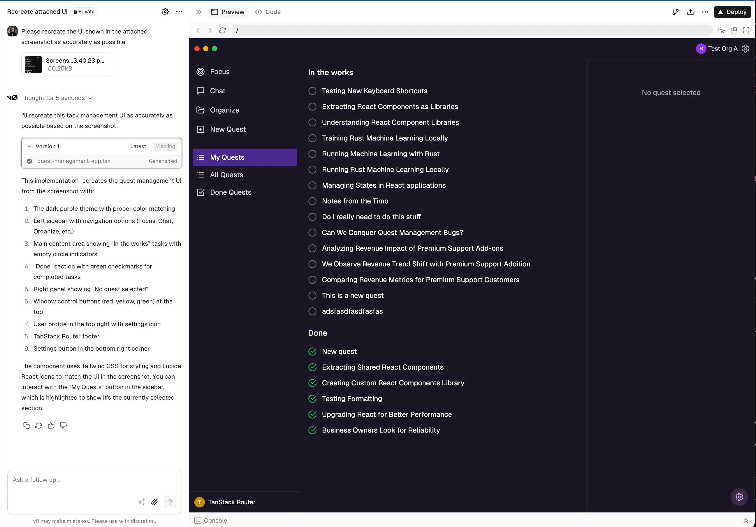
Instead of creating mockups in Figma or another design tool, I generate actual working code that serves as a "blueprint" for implementation.
The blueprint isn't just a static design—it's functional React code that demonstrates exactly how the UI should work, including animations, interactions, and state changes.
And most importantly - how far the boxes need to be apart from each other. 💀
This approach has a few major benefits:
- It's fast (I can redesign an entire section in half a day, cutting implementation time by 80%)
- It's cheap (each section costs about $15-30 vs. hours of design work)
- It's implementable (developers can reference working code)
- It's iterative (I can quickly make changes based on feedback)
- It's a 10x multiplier for our limited design resources
With our small team, we don't have dedicated designers. This approach has effectively multiplied my design capacity to incredible speeds. My co-founder Niko can take these blueprints and implement them in our app within hours, sometimes even faster.
The blueprint also contains instructions for other agents (Claude.md) and a generated Tailwind config so the styles can be retro-fitted.
These blueprint components were generated AFTER and BASED on the work I did with Claude.
Two Design Principles That Guide Everything
Before diving into tools, I want to share the two core principles that guide our design decisions:
-
What should you be able to see immediately?
- These are primary elements that users need to focus on
- For a journal app, this means your actual notes should be front and center
- Section titles, content, and key information belong here
-
What should you be able to find if you start looking for it?
- Secondary actions that aren't used constantly
- Example: Edit buttons that only appear on hover
- Features like adding tags—important but not something you're doing constantly
These principles help create a cleaner, more focused interface while maintaining all functionality.
The Process: From Sketch to Blueprint
Here's how I've been creating these code-based blueprints:
1. Start with hand sketches and user insights
I begin by drawing rough sketches based on user conversations. Nothing fancy—just putting ideas on paper to think through the basic structure and focus on what users actually need.
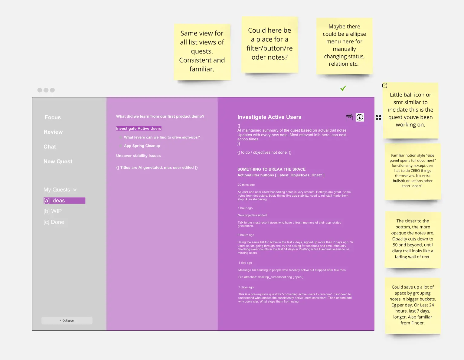
2. Create a basic layout in code
Instead of moving to Figma, I skip straight to code. I set up a simple Next.js project and use V0 (a code generation tool) to create a basic layout. This gives me a functional starting point that I can run locally.
3. Refine with AI assistance
Here's where things get interesting. I use Claude Code directly in my terminal to help refine the design in two distinct ways:
First approach: Work on single sections pedantically
- Tweak headline sizes to improve hierarchy
- Adjust spacing and padding for better visual balance
- Add subtle animations (like showing edit buttons on hover)
- Improve text contrast and readability
Second approach: Brainstorm new sections
- Describe what a new section should allow users to do
- Ask for multiple design options (I usually ask for five)
- Review each option one by one
- Choose the best approach, then refine it
4. Commit changes constantly
This is crucial—I commit changes to Git frequently throughout the process. This saves me when Claude occasionally gets confused and provides something that doesn't work.
Like, I'm not joking. Git commit almost every refinement.
5. Create a theme configuration
Once the design feels right, I create a theme configuration file that standardizes colors, spacing, and other design decisions so they can be applied consistently.
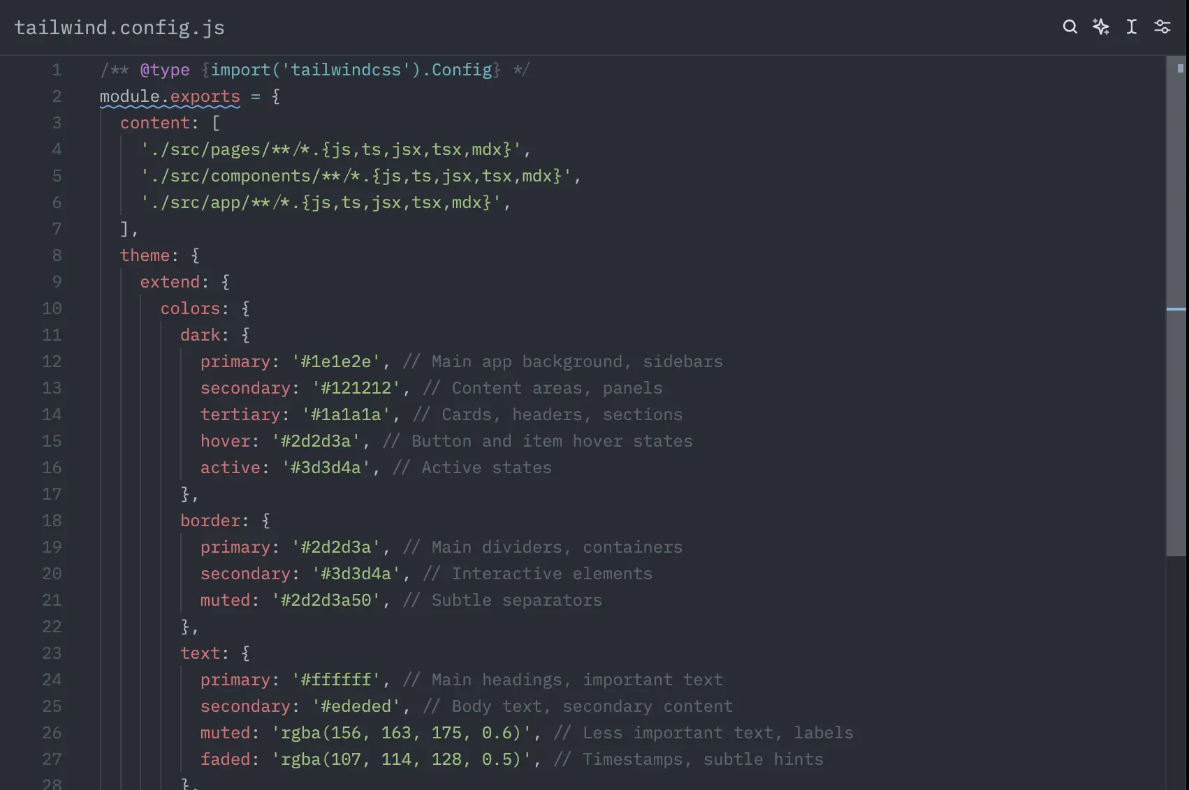
5b. Document design decisions in Claude.md
This step is crucial for maintaining consistency. I ask Claude to update our Claude.md file with specific design decisions, component patterns, all based on the work we've done together.
This serves as a living style guide that both human developers and AI coding assistants can reference. Including things like:
- Spacing rules and component hierarchy
- Animation timing and easing functions
- State management patterns for interactive elements
- Accessibility considerations
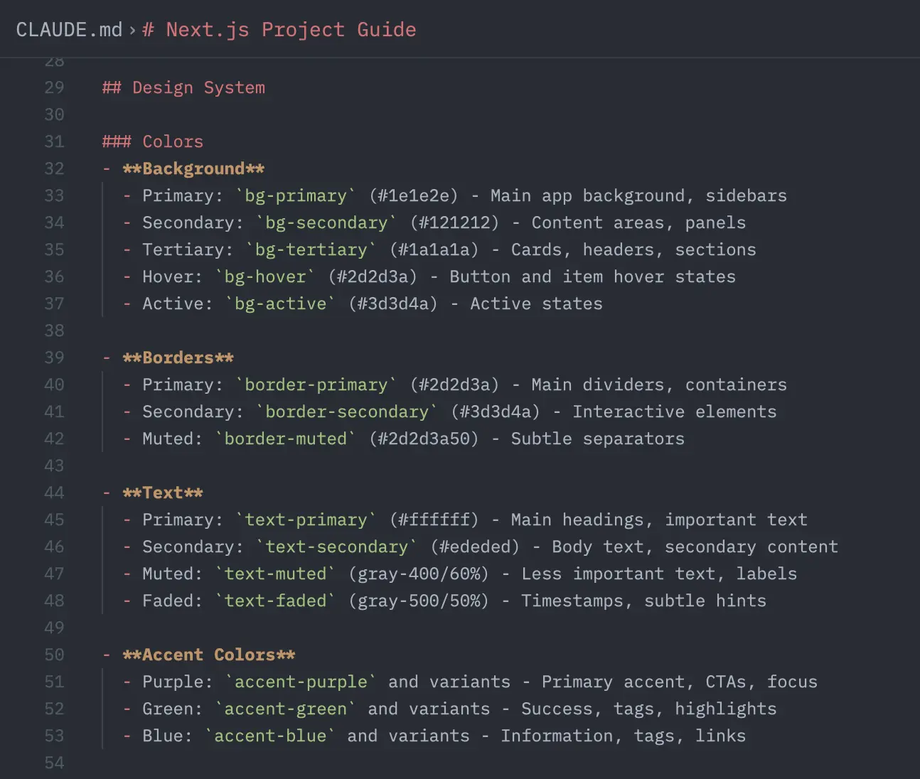
With these documented, we have a single source of truth for our design system that helps both humans and AI agents understand our design language.
6. Hand off to development
The final step is giving the UI blueprint to Niko for implementation. Since it's already working React code, the implementation is much faster than starting from static designs.
What Makes This Approach Different
The traditional design-to-development handoff has always been problematic. Designers create mockups that look perfect but might not account for technical constraints. Developers then have to interpret those designs and make judgment calls that might not match the designer's intent.
Not only that, but the developers have to actually build the small functionalities, often at the same time as they build the core functionality of the design.
With a code-based blueprint:
- There's no ambiguity about how something should work
- Interactions and animations are demonstrated, not just described
- Technical constraints are addressed during the design phase
- The result is production-ready code, not just a pretty picture
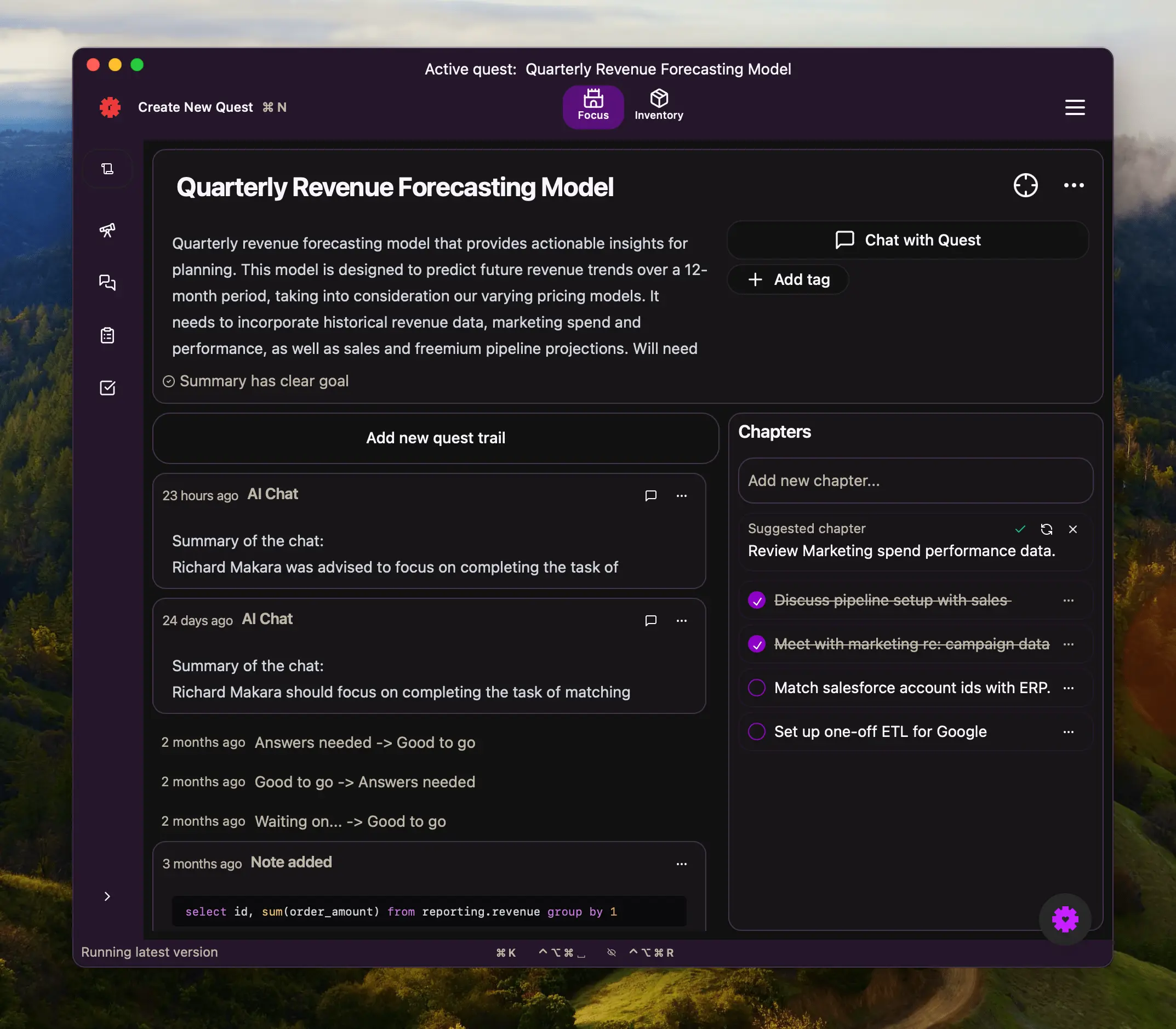
A Concrete Example: The Context Manager
Let me walk you through a specific example of how we applied this to our journal chat feature.
We needed to create a context manager that would let users specify what content to include or exclude when chatting with their journal. This is a complex UI challenge—how do you make something powerful enough for detailed control but simple enough for quick use?
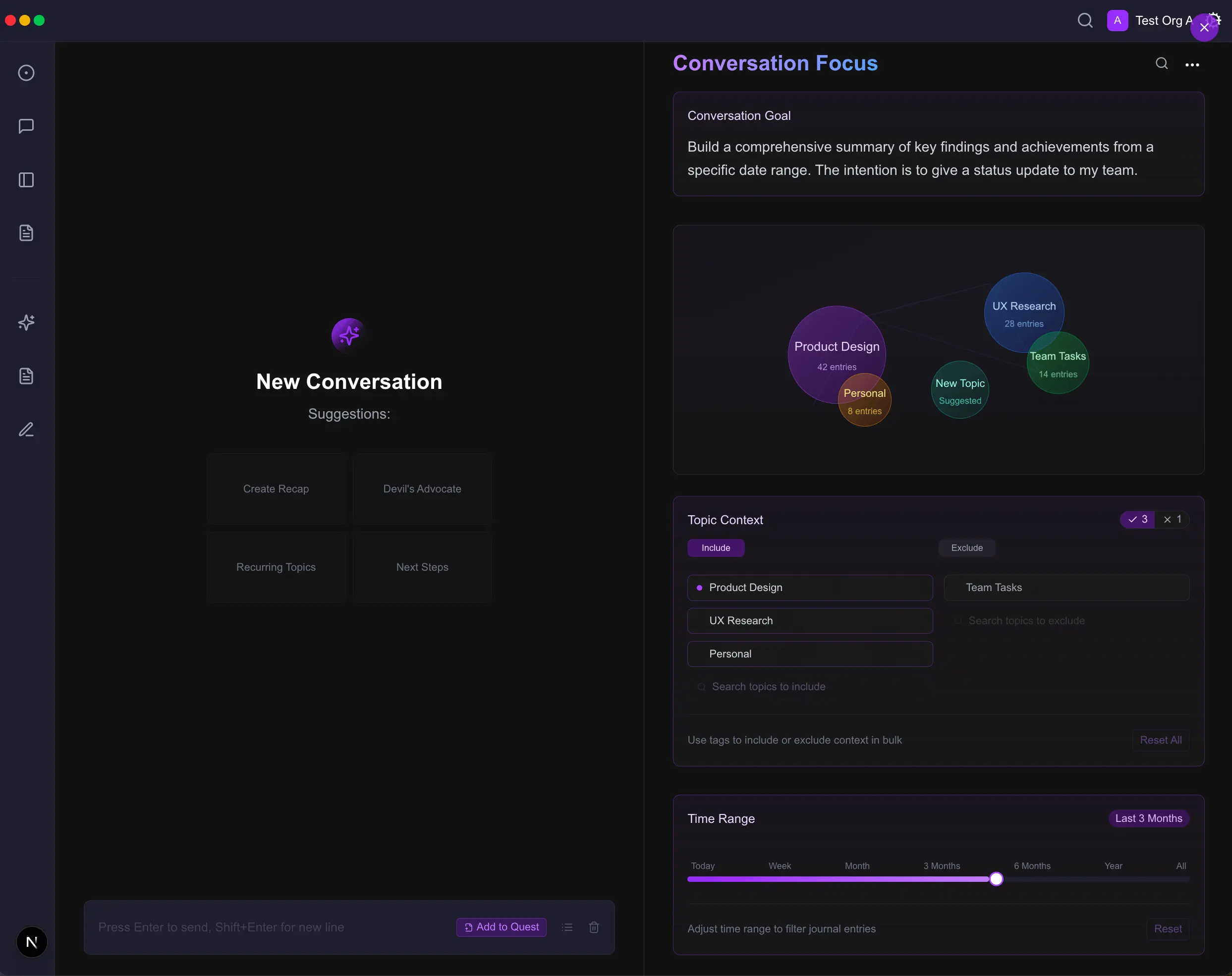
Here's how I approached it:
-
I described the section to Claude: "The user needs to be able to select what topics are included in the journal conversation and which topics to exclude. It needs to be visually appealing and very clear."
-
I asked for five different design approaches, then reviewed each one.
-
After selecting an approach, I refined it pedantically—adjusting the visual hierarchy, adding subtle animations for selecting/deselecting topics, and ensuring it felt cohesive with our app.
- The final result was a clean interface that makes it easy to include or exclude topics while keeping the UI uncluttered.
This entire process took about half a day, and Niko was able to implement it within hours.
How to Create Your Own UI Blueprints in Code
Want to try the UI blueprints in code approach for your next design challenge? Here's how to get started:
1. Set up your environment
- Create a simple Next.js project (
npx create-next-app my-design-sandbox) - Install any UI libraries you typically use (Tailwind, Material UI, etc.)
2. Start with a simple layout
- Use V0 or another AI coding tool to create a basic layout
- Alternatively, hand-code a simple version of your design
3. Refine iteratively
- Focus on one section at a time
- Be pedantic about details—this is where the magic happens
- Commit frequently to save your progress
4. Use AI wisely
- Ask for multiple design options to explore different approaches
- Be specific about what you want to change
- Remember that AI is a tool, not a replacement for your design judgment
5. Auto-document your decisions
- Create a theme configuration file to standardize design decisions
- Add comments to explain complex interactions or animations
The Results
Since adopting this approach, we've been able to redesign entire sections of our app in a fraction of the time it would have taken using traditional methods.
Our UI is cleaner, more focused, and better aligned with our users' needs. And because we're working in code from the start, we've eliminated the design-development gap that often leads to compromised implementations.
The UI blueprints in code approach has been a game-changer for us, allowing us to move quickly while maintaining quality. It's especially valuable for small teams where resources are limited and every hour counts.
At the end of the day, moving forward matters more than pixel perfection, especially at our stage. This approach lets us make meaningful progress every day while building a product our users actually want to use.
What's Next for UI Blueprints in Code
I want to be clear—this isn't just a quick way to generate some vibes. It's a design methodology that cuts implementation time by 80% and works extremely well for us. I'll be exploring and probably refining it for the foreseeable future.
Because I came up with this process out of necessity rather than learning it from somewhere, I'm constantly discovering new ways to improve it. I see tremendous potential here for small teams like ours who need to maximize their design and development resources.
Some directions I'm exploring:
- Creating a more structured template system within our UI blueprints
- Building a component library based on successful blueprint patterns
- Refining the handoff process between design and development
- Exploring how we can apply this to more complex UI challenges
So the next time you feel that urge to throw your app in the trash and start over, try creating UI blueprints in code instead. You might be surprised at how much you can accomplish in just half a day—and how much implementation time you'll save.
P.S Want to try reconfigured's flexible approach to note-taking? Get started for free and discover how it might adapt to your unique workflow.